Killer Map Pack
Killer Map Pack
- Release Date : 7-31-03
- Author : The-Killer and Rocker12
====================================================
--- Play Information ---
- Game : Unreal
- Single Player : no
- Cooperative : no
- Deathmatch : yes
- Dark Match : no
- New Sounds : no
- New Graphics : yes
- New Music : no
- Known bugs : none
- Author : The-Killer
- Version : 224
- Release Date : 7-31-03
MAP
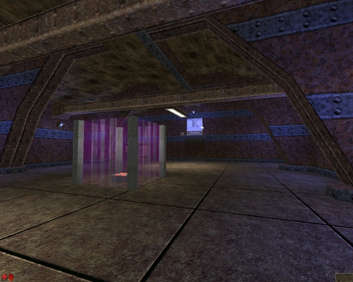
Deck16Killer Style1a . . . Author The Killer . . . . review by Xavious
A disappointing map indeed. You expect more than this from a DmDeck16 clone, and this really doesn't do it justice.
The one redeeming feature of this map is the nice spawning system. There are four identical areas built away from the main map, where players can spawn. From there, they can pick up a few weapons, then choose which area of the map to spawn to. Many maps could learn from this system.
More importantly, however, many more maps could improve on this system. It is simply not used to its full potential in this map. For example, there is the chance that you could accidentally telefrag your opponents when teleporting into the main map. Also, the spawning areas could have been a bit more than simply a place to grab some weapons and then spawn...
There isn't anything else nice about this map. Even some nice things in the original map have been degraded, the best example being the use of panning, masked textures on the walkways over the slime.
The geometry is very, very basic, especially areas such as the 'practice area' and the area at the high asmd.
Highlights: The spawning system; warlords in the practice area look nice.
Lowlights: Too many to mention.
Geometry: 2/10 - Increda-basic. Nothing even remotely fancy. Lighting: 3/10 - Also basic. Nothing special at all. Textures: 1/10 - Degrades the whole map even more... Inventory: 6/10 - A bit weird...For example, there are two sets of jump boots right next to each other... Bots: N/A - Not tested. Probably about the same as for normal Deck 16
Overall: 2/10 - Reeks pointlessness. I don't know how else to describe it...
DmKiller-Terra. . . Author The Killer . . . . review by Xavious
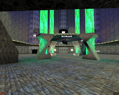
Just like Killer's other map, DmDeck16killerstyle1a, this map is filled with textures with the author's name on it. I've said this before, and i'll say it again, there is really no need for these kinds of textures. The author's name can be gleamed from the 'Author:' section of the map info. In my personal opinion, it just makes the map feel cheap.
Other than that, its a nice enough map. There's nothing special here, other than a nicely placed shieldbelt. Bots function fine in the map, and weapon placement is OK. Some of it seemed a little pointless though, such as the ASMD cores sitting on the pillar (which is simply annoying since you have to go back up the lift after collecting one if you need another) and the skaarj and mercenary with the new skin.
The bot in the 'Killer' skin on display in the wall was cool though..
Highlights: The shieldbelt; the bot on display.
Lowlights: The mercenary and skaarj on display, some of the weapon and item placement.
Geometry: 6/10 - Not bad, especially the outside areas Lighting: 6/10 - Equally as 'Not bad,' compliments the geometry. Textures: 5/10 - Good, except the 'name' textures... Inventory: 6/10 - Good enough, could have used a bit more work though. Bots: 6/10 - They work fine.
Overall: 6/10 - A considerably average map, worthy of a look only if you are a fan of the 'mine.utx' package.
DmSWBA. . . Author The Killer . . . . review by Xavious
Woe to the Skaarj Queen. She has had her home ransacked by some fool who enjoys graffitying his name all over the walls. This vandal has also decided to shove loads of powerups around the place, and many textures which are just plain black.
This map is the height of laziness. Most of the geometry is taken straight from the QueenEnd.unr map of unreal's original single player levels, and the geometry that he has added is a bit crap. Again, the walls are covered with textures advertising the author's clan.
Weapon and item placement is shockingly shoddy. Weapons are very sparse, and powerful items such as superhealths and shieldbelts are all but a jump's distance away from each other. There are only two redeeming features in this map, one being the cool texture on the wall of the guy holding the sword, and the other is the everlasting jump boots, which I think add a new dimension to the game play (although they are completely wasted here).
Highlights: None significant enough to mention.
Lowlights: Nigh on everything...
Geometry: 1/10 - The good geometry is copied from another level. Lighting: 1/10 - Again, good lighting is copied from another level. There are inexplicably shadowed areas for added crapness. Textures: 2/10 - Crappy black textures. That guy on the wall with the sword just scrapes an extra point in this category. Inventory: 0/10 - Pfffft. Many 'tut-tuts' all around. Bots: 1/10 - Crap, obviously, since they can't use jump boots. Jumppads would have been nice.
Overall: 1/10 - 'How a map should not be done' for dummies.
DmHazardKiller. . . Author The Killer . . . . review by Xavious
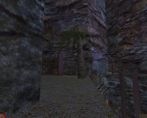
The tried and tested formulae of 'mine' style maps. Heavy use of the 'Mine.utx' package, and minimal lighting. always makes for a nice map, when done properly. And here, I can safely say it is done properly. Basic mine map with one or two extra features, mainly the bridge which is submerged in toxin by pressing a switch elsewhere in the map. When someone stands on the bridge, an alarm goes off and the switches are made accessible to players. Any poor fool on the bridge when a switch is pressed gets treated to a particularly poisonous death.
Only three problems with this map, in order of least importance to most important:
Firstly, i found myself saying "We get the idea, already! Your name is Killer! Stop with the naming textures!" I mean, it seems like just a waste of resources to make these textures and put like 3 or 4 into the map.
The slime doesn't look like slime. You could argue that your meant to jump in and find out, but in this instance it just seems silly. The best slime has a nice bubbling sound, and a faint green light, plus some green fog, and a nice slimy green texture. This just looks like it came out my bathroom wash-hand basin...
Now for the bigger problem. The map is superbly pathnoded, which can be seen by pressing tab, typing 'show all' and hitting enter; they are the optimal distance apart, the jumpnodes are all in the right places, and it all looks like it should run quite smoothly with bots. Problem is, the paths have not been rebuilt! The bots just stand around looking like a blonde in an electronics store! It is quite a shame, since a minute of testing would have revealed this error to the author, who could have fixed it easily...
Highlights: The two cool lifts by the shieldbelt; The boxes used as makeshift stairs; The submerge-able bridge.
Lowlights: Paths have not been rebuilt; Silly author's name textures; Boring slime...
Geometry: 7/10 - Good. Nice lifts, and walkways looks cool. The gaps in the walls to shoot through are nice too. Lighting: 7/10 - Dark and gloomy. Goes well with the texture set. Textures: 8/10 - Nice. Especially around the doors and corridors. Inventory:7/10 - Optimal. Nothing more, nothing less. Just right.
Overall: 7/10 - Nice map all round. Disappointed with the bots though.


